Site Design
I may have used affiliate links for some of the items in this post. Using an affiliate link to purchase an item won't cost you any more money, but I may receive payment if you click on a link and make a purchase. For more information, visit the disclosures page.
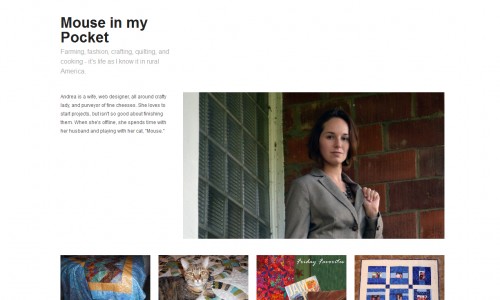
I’m thinking about making some updates to the design of the website, to add a little color and better reflect where our blog content is going. A friend of mine was telling me about web design by Third Angle (she also has a website that she wanted to re-design) and it inspired me to change my website up too. I know my website looks really old and outdated but I’m scared to change it! There are so many amazing web design companies out there that would do an amazing job but it’s just about taking the plunge. I could change up the design to focus more on the images since so many of my posts now are about projects. I’ve found a couple of blog designs that would be great jumping-off points for something like that.
I was also thinking of creating a new website. I have come across many designs that have attracted me. Some of my friends who already have websites suggested me to take the help of Custom CMS software applications (for building a new website). When I enquired further regarding this tool, I got to know that applications like these can be beneficial for creating, designing, and managing websites. By using these applications, users do not have to build a site from scratch. Furthermore, whenever changes are needed to be made (even simple ones like updating content) users can just download files from the server, open them, and change the HTML code by hand. To be honest, I am a bit tempted to use this tool. Who knows, I might as well create a new website!
Now, that’s not to say that I don’t love my current website design. I’m just starting to feel like it needs a bit of an update (and if the update does not work then I will think about creating a new one). Maybe I need to add a bit more color, or a new background image for the blog. I think I may decide to check out plenty of pixels web design in charlotte and their design portfolio because I had heard through the grapevine that they were meant to be good when it came to incorporating these features. It’s not going to do any harm to have a look, is it? Do you think something like that would be pretty, or do you think it would distract from the projects?
When running a business, a well-designed website is an asset that can help you to reach a wider audience and even attract potential customers. One of my best friends owns a business in South Carolina and recently had her website redesigned by a team of Web Design Greenville experts. Sometimes these things are best left to the professionals after all.
What would you like to see on my website? What do you think I could change?


hello! i’m new to your blog, and i’m following now!
i actually really like the white background! it’s easy to read and there’s so many cute buttons and things that you can do with it!
typically when i change up my blog, i keep it white and then just change my graphics and things.
can’t wait to see what you decide to do, though!
have a great weekend
morgan
Quite the Blog
Thanks so much! I stopped by your site too. I love the chalkboard buttons you’re using. They’re fun and classy at the same time.
love the clean simple look but maybe a pop of colour with graphics? thanks for linking up for the aloha friday hop 🙂
Thanks for the recommendation. I’ve started that process by adding some color to the menu bar, and setting up a lighter colored version or the logo from the highlighted version, to keep color in the header all the time.
Looks good! I like how it’s easy to see the projects -very clear and visually striking. Good luck with whatever you decide!
Thanks Valerie! Based on some other feedback I’ve already made a few changes. I added the yellow to the navigation, so that it wasn’t just grey, and put some color in the logo at the top, which was originally just black/white unless you hovered over it. I really do appreciate everyone’s input.