If I Designed a Fabric Line
I may have used affiliate links for some of the items in this post. Using an affiliate link to purchase an item won't cost you any more money, but I may receive payment if you click on a link and make a purchase. For more information, visit the disclosures page.
After seeing all the beautiful fabric lines at Spring Quilt Market, I am really looking forward to sewing up some great new projects. (And yes, Matt, I promise to finish the ones I have started first.) I saw a lot of fabrics that I loved, but something was missing. The neutrals. There are rarely any lines that focus on neutrals. If I were making a line of fabric, I would want to make one entirely in neutrals with great prints, so here are a few ideas from me to you.
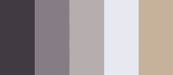
My palette would start with a deep charcoal grey, and then move into a mid-range grey with a touch of lavender. Then I would use a color I once saw on a paint chip, dolphin grey – it’s neither brown, nor blue, and it goes with both, contrasting well. I’d also want an almost white – but not cream, a touch of icy blue instead. Finally, I’d add a nice light tan color, slightly orange against the blue. It’s a palette that is filled with color, tho you might never notice it.
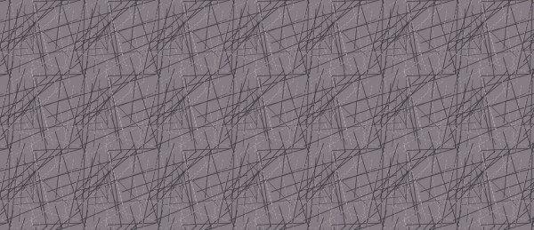
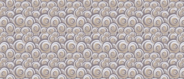
My prints would be full of strong edges, but maybe curves. It seems the neutrals I do find have a “grunge” look with broken lines and blending. That’s not necessarily a bad thing, but I want something different, something stronger.
If you were creating your own fabric line, what would you design?


Nice! I love neutrals! I’m making a big effort at the moment to move toward color, but I always return to beautiful tones of rich grey and vanilla.