#OurProject52 – Negative Space
I may have used affiliate links for some of the items in this post. Using an affiliate link to purchase an item won't cost you any more money, but I may receive payment if you click on a link and make a purchase. For more information, visit the disclosures page.
Negative space isn’t something that comes naturally to me when I take photos. This is probably because I like closeups so much. I’d much rather take fill my frame with the subject, than leave empty space, so this was a great exercise for me.
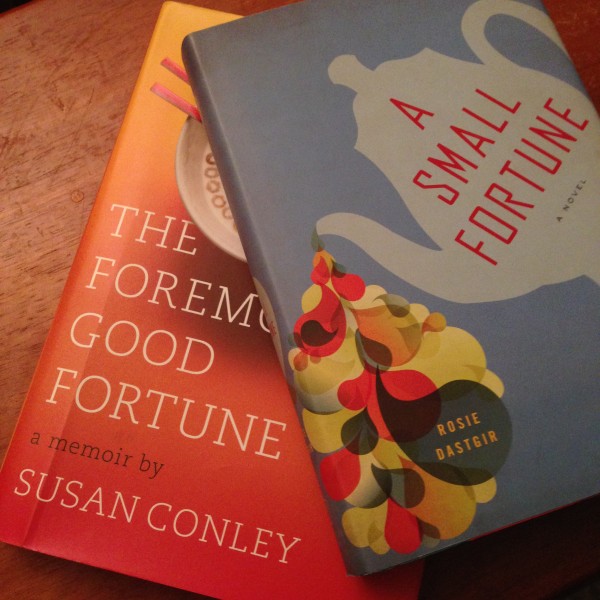
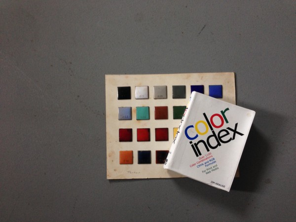
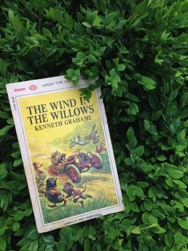
I’ve been doing a lot of book photography lately for my book reviews, and I always seem to cut off part of the book covers to get more of a closeup style. I thought I’d give some negative space a try, using textured backgrounds to see what I got, and I’m surprisingly happy with the results.
I think I will have to push myself to use negative space more effectively in the future.
Sharing over at:
#OurProject52 at Everyday Eyecandy and Lipgloss & Binky


This is an interesting concept. I also typically prefer full frame to negative space when taking photos. I’ll have to think about negative space more.
I’m glad I’m not the only person that has trouble with this. My obsession with macro photos, really does make me want to push in tight on my subjects.
I’m all about the negative space. I think I was shooting that way even before I knew what it was.
I like the way you placed the books on texture — it complements the book titles.
Thanks so much Daenel! I hope you’re enjoying your new place and finding lots of things to photograph.